
Mosaic Data Selfie!
A creative-tech, analog/digital, participatory/self-reflective process journey!

Prologue:
This article is about a creative journey that I went through that intertwines experience design, data, art, code and creation. It goes like this:
designing a community data selfie → converting it into data → trying to analyse what the data said → recreating it in code → writing about the whole process!
Why did I do this, you might ask? And that would be a valid question. I’ve been asked it many times!
“I use hula hoops to teach math.” “Why?!”
“I programmed my poi with the reds and blues of climate data and created a data performance”. “I have just one question. WHY?”
So now, saying I recreated this data viz in code can invoke the same exasperated why, understandably.
I’ve been wondering why myself! I was talking to my partner about how this might be a question I hold for life. But he gave me a beautiful answer immediately. He said, “Because it’s never been done before.”
That gave me that dopamine I needed to finally start writing this blog! So here goes:
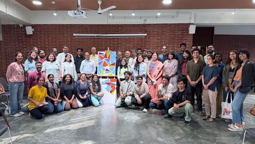
The Mosaic Data Selfie:
On Jan 3rd, 2026, a new Science Community called Mosaic was launched! I was part of the organizing committee through Paper Crane Lab (PCL).
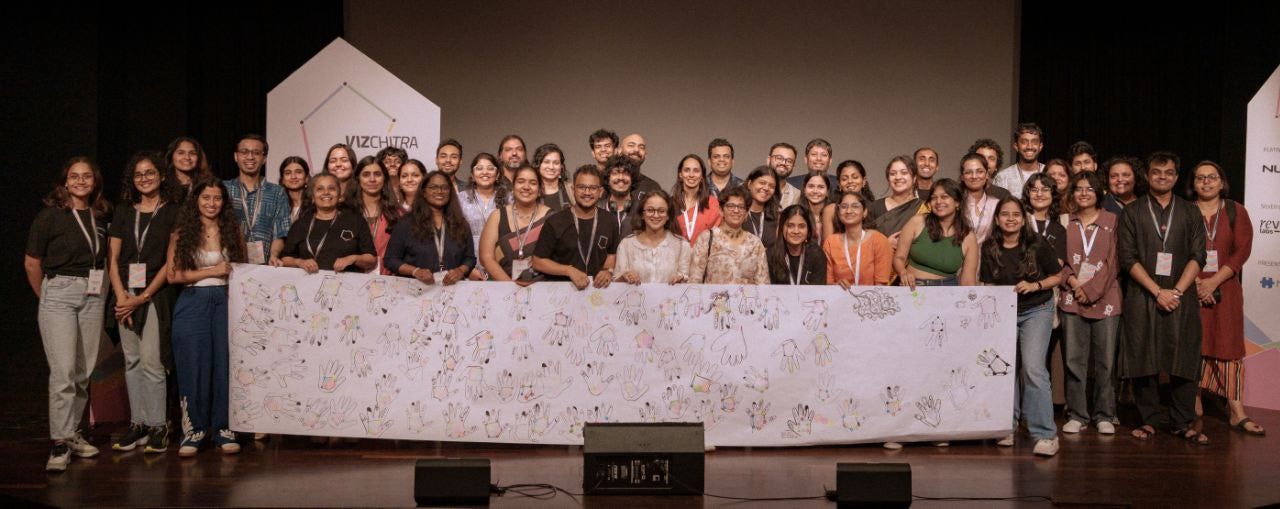
Mathura, my founder and I both enjoy using the Data Selfie concept for events, so we knew we had to do it for Mosaic! I made my first one in August 2025, called Hands of Vizchitra. (Hopefully will blog about that one soon!)
So what is a Data Selfie? To me, it’s a way to add a human, whimsical touch to demographic data. Normally, people entering an event are reduced to spreadsheets: name, age, email, address. But a data selfie helps us see everyone in the room as a fun person with likes, dislikes, feelings and a personality! And collectively, it shows the room as a playful, vibrant community!
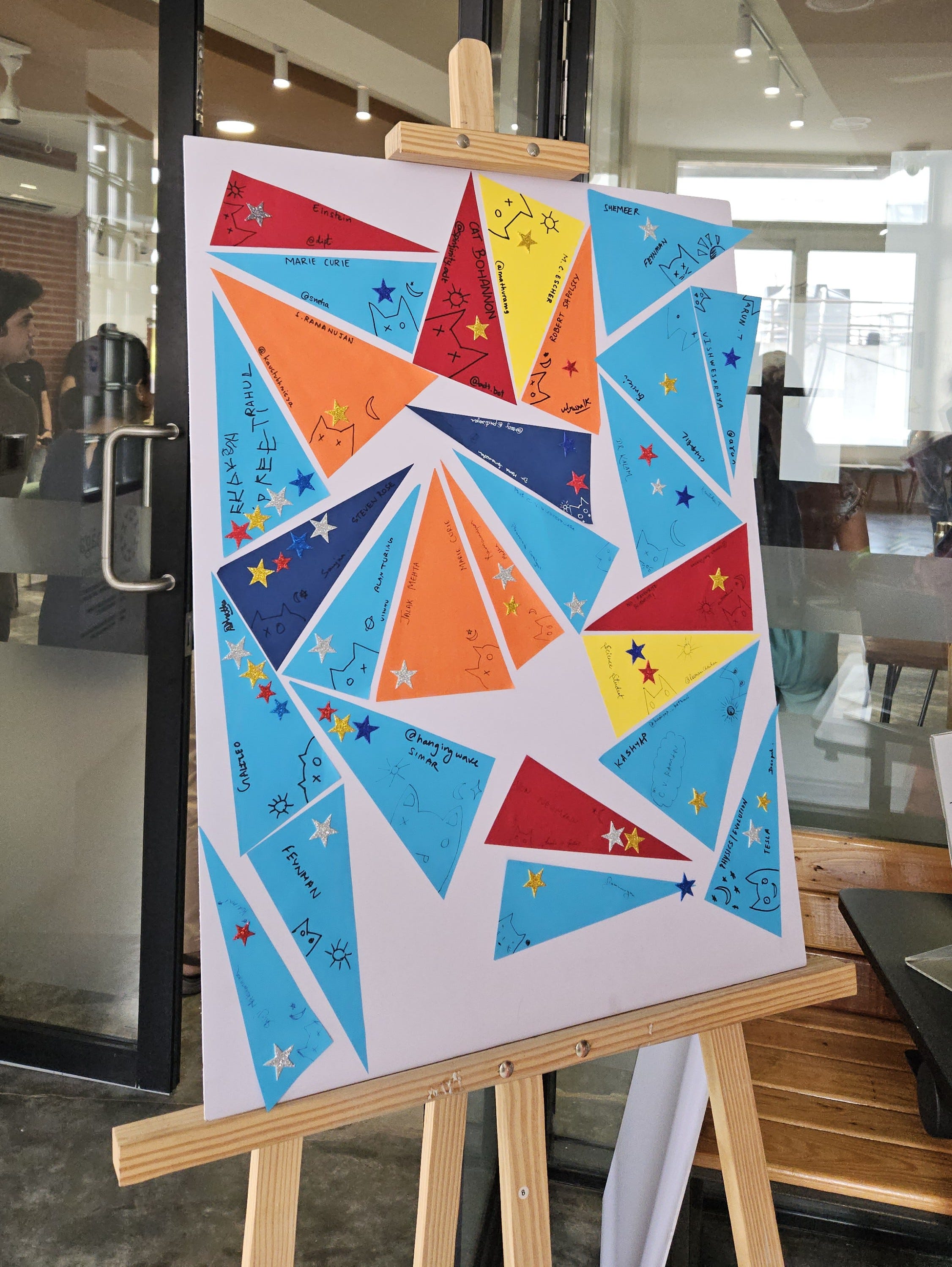
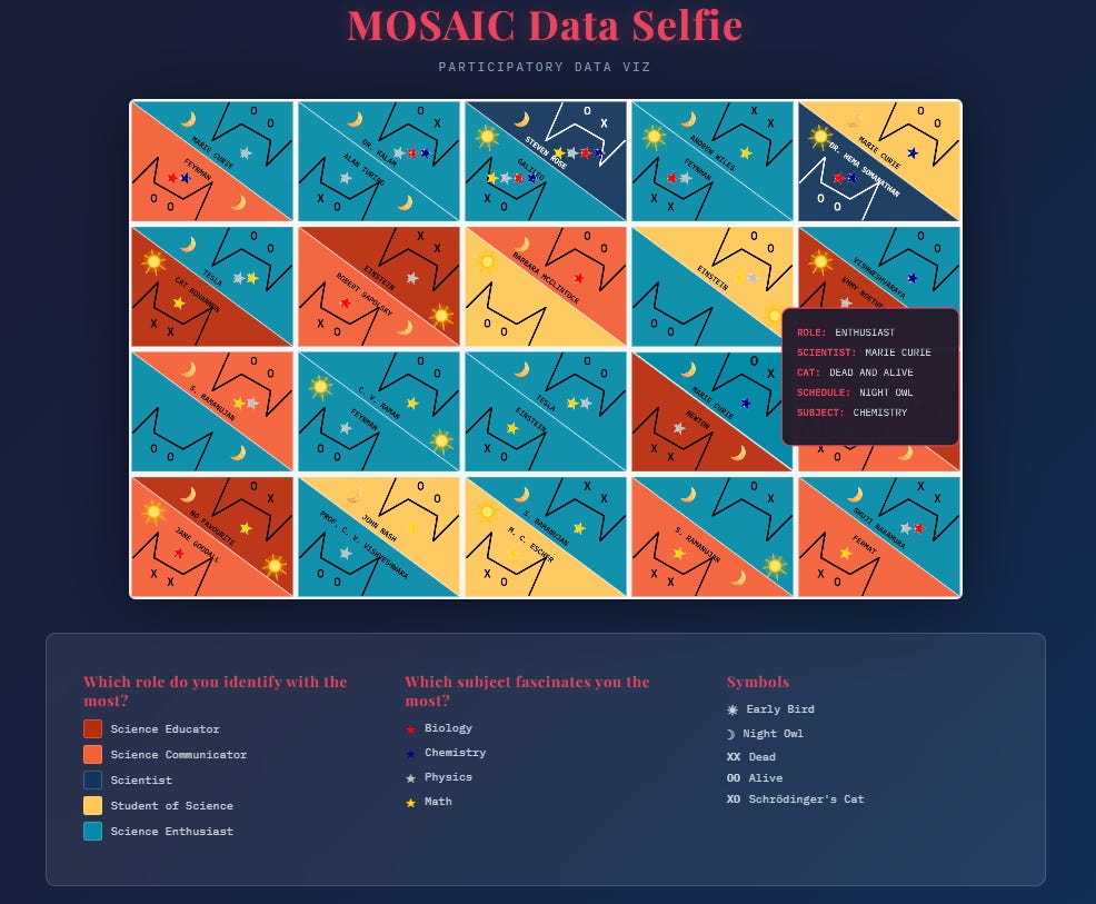
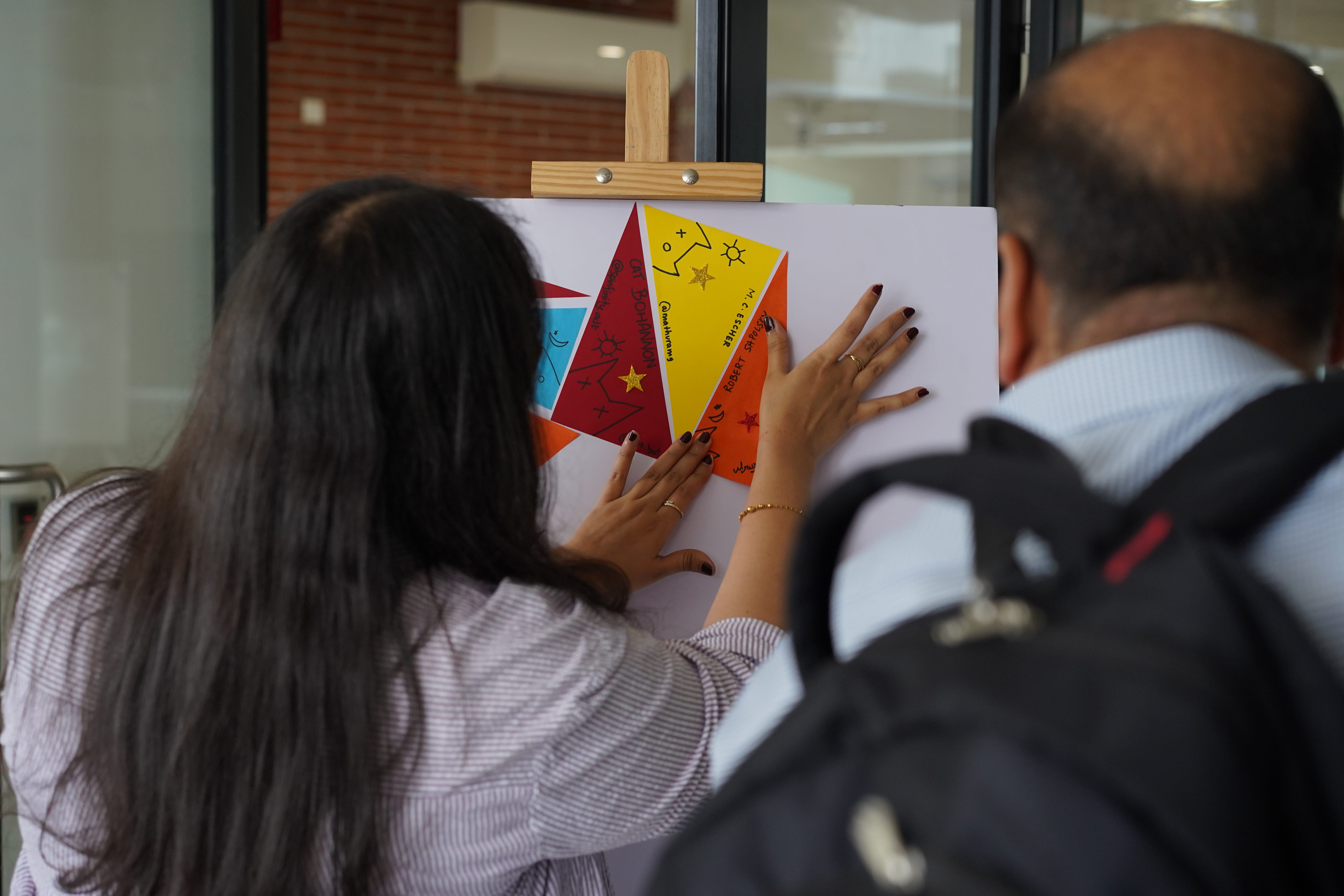
Here’s what the Mosaic Data Selfie finally looked like!
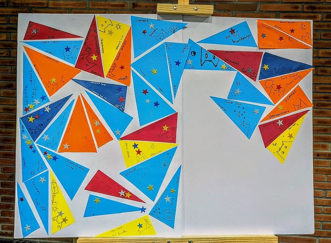
Here’s the recreation in code!
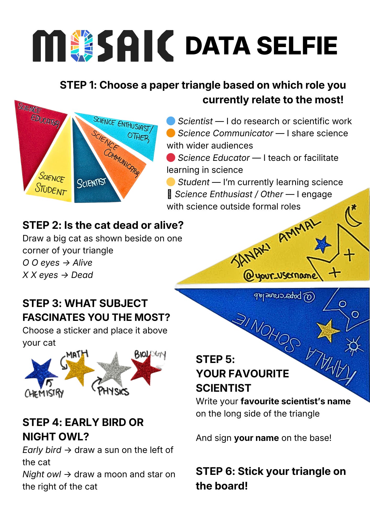
The instructions for the analog version:
I learnt about the Data Selfie concept through Dear Data, this super awesome project that is always running a thread in my brain, cause of how it makes art out of data.
Yes it’s harder to crunch numbers and calculate data when it’s in this form. But here are some more things that participatory data vizzes can do!
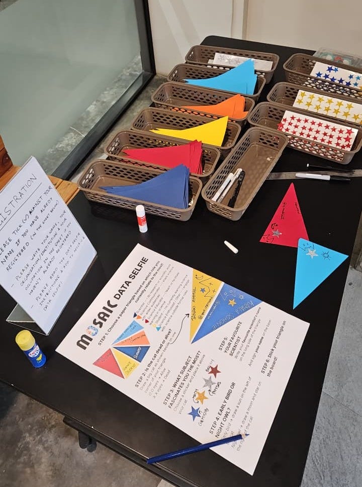
They’re an amazing ice-breaker/mood setter (we designed it as the first thing they do as part of the registration process)
Help people express themselves through hands-on making. People who think they can’t draw or make art, ultimately create something fun!
Can be a great way to know more about people without falling into biases and being extractive. Underlying this data selfie was a desire to show scientists as colourful people
How I went about designing this:

Mosaic has a beautiful logo designed by Krutika Thakkannavar. My original idea was to have triangles around the hollow of the letter O, recreating the logo. But this would’ve been too much instruction for participants. We wanted to keep it self explanatory and simple.
Even for Hands of Vizchitra, I took inspiration from the VizChitra logo, that had a very fun arc. (I really need to write about that!)
Back to Mosaic: the logo set the base with triangles, and then came the questions. Mathura and I were looking at the Data Selfie instructions for inspiration. I read aloud the “Is the glass half full or empty?” and Mathura immediately said “We should ask ‘Is the cat is dead or alive!’”. And I think that one gave this data selfie its whimsy and personality.
We thought about what we wanted to know about participants, and that led to our 5 questions:
Professional roles: These became the triangle colors. We wanted to bring in wide range of folks in science, from hardcore scientists to enthusiasts
Fields of interest/fascination: Colored star stickers.
Favorite scientist: Since few women scientists are popularly cited, we wanted to know which scientists inspire people of science. So we asked participants to write the name of their favorite scientist along the hypotenuse.
Early bird or night owl: The sun on the left of the cat for early birds, a moon on the right for night owls.
Cat dead or alive: Draw a cat at the vertex, X eyes for dead, O for alive. Many participants drew “XO” cats — Schrödinger’s cats! This wasn’t an option; we were curious to see if people would do this, and we weren’t disappointed.
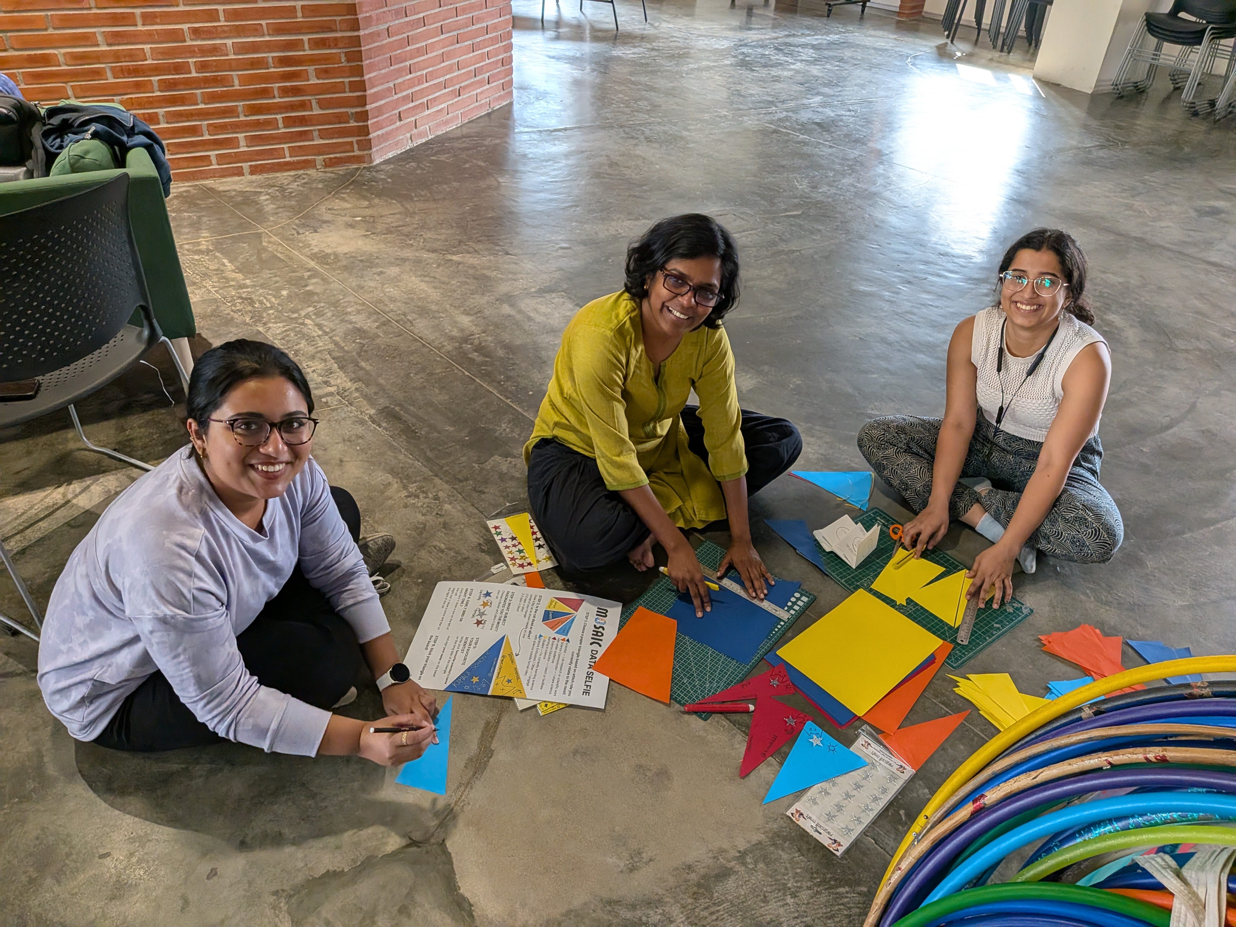
Then came the prepping of materials, here’s us in action cutting up triangles and arranging them the previous day!
How it went on the day
On the day, I was juggling the event itself, but because of my attachment to this project, I kept popping in to see how the activity was going. Folks seemed to enjoy it. I heard things like, “This is such a nice way to see who’s in the room,” and “I had fun doing this.” People were especially pleased with themselves for marking Schrödinger’s cat with an X and an O. Folks asked each other, “Which one’s yours?” and showed their each other their triangles. One person mentioned that it would’ve been nice if it would be used and incorporated into a session, great point for next time! Maybe like the Human Spectrum ice-breaker.
Some folks did need gentle prompting, and I was that person going, “Hey, have you tried this yet?”. I was probably the most excited about this in the room xD Around 40 of the 70 attendees participated. A few people arrived mid-event and skipped registration, which could have affected the number, but I don’t have enough info.
I also got feedback (even during testing) that this does take more cognitive load than I thought — a good four to five minutes of attention to read and complete. Finding the balance between inviting people to slow down and participate, without making it feel like “too much right now,” is a tricky part of the design puzzle for me.
I don’t have enough feedback to really understand how it went, so if you were there, I’d love to hear your experience!
Data Cleaning and Analysis
After folks made the data selfie, I put everything into excel and did a bit of “analysis” - mostly pivot tables, trying to see patterns like what percentage of communicators tried to save the cat.
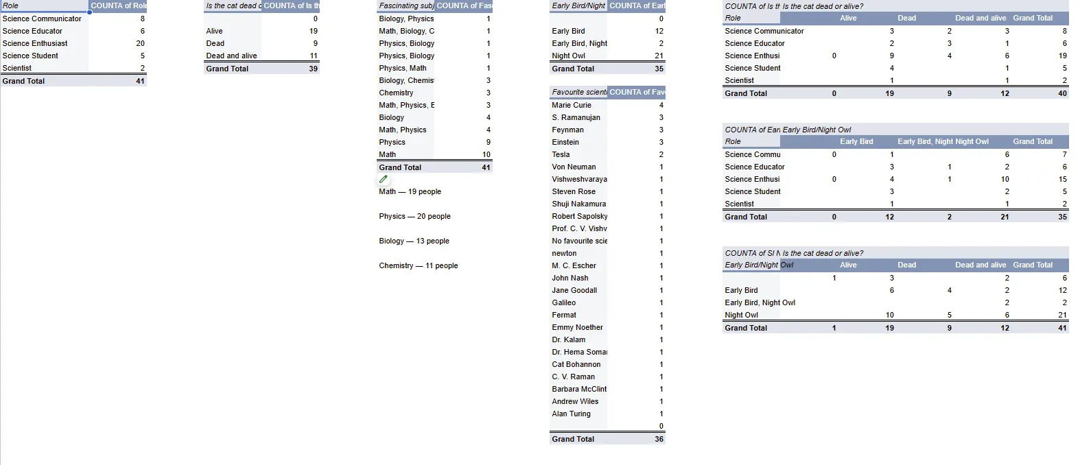
The sample size is way too tiny to make big claims, so do treat this as data enthusiast playing around with frivolous data. Here’s what I found:
Professional roles: 47.5% of people chose “Science Enthusiast” and only 2 out of 40 chose “Scientist”! At first glance it looked like the event mostly attracted folks new to science. The petty part of me thought “Maybe the scientists didn’t think this activity was worth their time!” cause about 70 people did attend the event. But the reality is that most people are just super humble — even the director of the planetarium chose Science Enthusiast! The two folks who filled “Scientist” were delivering talks at the event, so they were possibly donning their scientist hats when they entered! So many assumptions can be made about all this —but that’s all they are at the end of the day— assumptions.
Cat dead or alive mapped to roles:
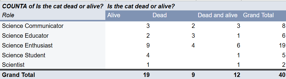
Educators leaned towards killing the cat, maybe because curiosity is what kills them anyway! Science Communicators were the most evenly split , and had the highest percentage of “dead and alive”, probably cause Schrodinger’s cat makes for fun Science Communication! And Students were surprisingly optimistic.
Early bird or night owl: More Night Owls than Early birds. Also higher “Educator” percentage in the early bird group, possibly having to wake up for class. I guess waking up early makes you want to kill cats!
Subjects of interest: Physics (19), Math (18), Biology (13), Chemistry (10). Many participants picked multiple subjects.
Favorite scientists: The list was wonderfully eclectic. Top votes went to Marie Curie (4), Srinivasa Ramanujan (3), and M. Visvesvaraya (3). Everything else was unique, from Feynman to Jane Goodall, Emmy Noether to Cat Bohannon.
Marie Curie, S. Ramanujan, Feynman, Einstein, Tesla, Von Neumann, Vishweshvaraya, Steven Rose, Shuji Nakamura, Robert Sapolsky, Prof. C. V. Vishveshwara, <No favourite scientist>, Newton, M. C. Escher, John Nash, Jane Goodall, Galileo, Fermat, Emmy Noether, Dr. Kalam, Dr. Hema Somanathan, Cat Bohannon, C. V. Raman, Barbara McClintock, Andrew Wiles, Alan Turing
One interesting thing for me in this stage was noticing myself falling into traps: forcing narratives, crafting “insights” from flimsy patterns. The point of data selfies is to bring out unbiased, human attributes, so this was a tricky tightrope to balance.
Recreating the analog data selfie in code (p5.js)
As soon as a project is “complete”, I have this weird tendency to do more with it. Nothing ever feels fully done or ready to put out there. That part of my brain went “Hey you’re learning p5.js and you really want to learn how to simulate hula hoop motions and stuff in code, why don’t you recreate the mosaic data selfie as a way to practice? You love triangles anyway!”
And there went a couple of hours of my life.
I tried to use Claude to generate a triangle tessellation, and gave it the excel sheet rows. (Don’t worry, I removed all the identifiable data like names and usernames). It really struggled to make the triangle tessellation, so I went online to see if people had done triangle tessellations, and found this grid:
https://github.com/areidakpena-ssis/Triangle_Tesselation_P5js/tree/main
It looks like a teacher was asking their students to complete it, so I thought this is great for me to actually learn. With some For Loops trial and error, I managed to generate a grid!
(Also a few days later I found a simple function in p5.js that already exists for this called Triangle Strip >.< Good lesson to not be lazy and just look at documentation properly)
Now I had the grid and the data! I tried giving Claude an image of one triangle from the analog viz, but it couldn’t recreate it. So I needed to give it the path of the cat, position of the sun/moon, stars, fav scientist text. I asked it to make me a base grid, almost like a paint application that will help me identify the vertices for the cat, and the exact positions for the sun/moon, stars and text.
I fed it the exact vertices, and it worked! Then came the process of working with Claude to improve aesthetics and add animations. I gave it the colour palette used in Mosaic’s logo which is also what we used in the Analog version.
The animations I added are:
sparkling effects for the stars. they were glitter stickers in reality so I wanted that feel
A rotating sun and cradling moon
The cat’s eyes becoming larger when a triangle is hovered on
After adding a legend, it felt ready! I pushed it to the domain I bought a year ago and never used, that was a nice little win.
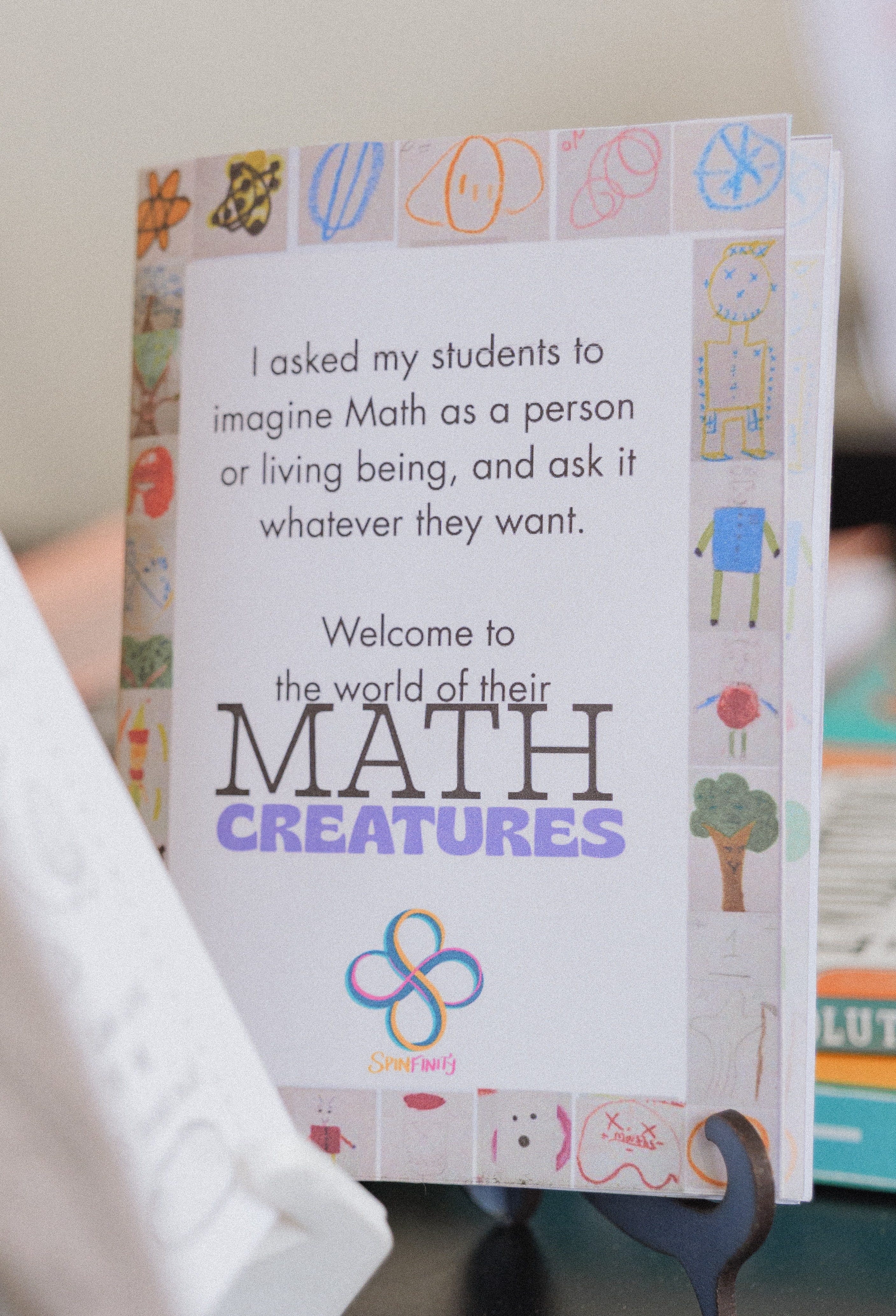
I also recreated this in code with the intent of getting more people to add triangles to this! I have another project called Math Creatures for which I wanted to implement this functionality. I was about to jump into building that functionality before completing writing, but caught myself in time. Hopefully soon, you’ll be able to add to this viz!
The final part - Writing about this process!
A lot of reflection happened in each step of the process, and is still happening as I write this final para. Since I started with a prologue about what pushed me to write this piece, I wondered: “Why did my partner saying ‘Because it’s never been done before’ push me into action?” I went to my journal to think about that, cause that branches off into a whole other personal quest. Somewhere in there is a hope for a sweet butterfly effect!
But also: the fact that it’s never been done (by me) is a good enough reason to do it. With the caveat that it shouldn’t do harm. And it did end up helping me directly! While writing the article, I got an opportunity to facilitate a vibe coding session at Vibe Shift for a cool Creative Tech Non-profit called Rhizome. The session is supported by Anthropic and will happen at Museum of Art and Photography Bengaluru! This whole process helped me reflect on my p5.js learning curve, and I hope that’ll be useful for the participants there. I have concrete suggestions on what works and doesn’t. We’ll most likely be making another version of a Data Selfie there!
Recreating it in p5js was especially fun cause as a “creative technologist” ( a newfound identity layer I’m slowly leaning into), it was very interesting to really get deep into the “vibe coding” process and critically see (from a humanist and code POV) how these models work. I do feel awful about all the resources I used/wasted, and that was a huge driving force for the question “Why should I do this?”. I honestly don’t know how to resolve this tension. And I’m gonna sit with it, rather than come up with a nice explanation that helps me sleep at night, like how AI tends to.
The code does flatten things in some ways. Each triangle looks too similar to each other. Each person’s personality doesn’t come out the way it does in analog. The different handwritings, placements, the different cats, little variations in the analog version makes the piece organic. But that’s also the journey I’m on— which is to learn how to get data and code to hold on to those human qualities.
Thank you for reading all the way here! I’d love to hear your perspectives and about creative journeys you’re on. Please drop a comment! And stay tuned for more projects that lie at the intersection of art, code and movement! I’m working on a fun series where I recreate math forms through hula hoop and poi shapes :D
Very cool!